Crochet Color Palettes for Home Decor: How to Choose Yarn Colors
Choose yarn colors that suit your room: the 60-30-10 rule applied to crochet, neutrals plus one accent, five ready-made three-color palettes and a quick swatch test.
Project at a glance
Good crochet color palettes for home decor begin with the room, not the yarn shelf. A pillow or throw that repeats colors already present looks as if it belongs there; one chosen in isolation tends to look like a visitor. A few simple rules, five ready-made palettes and a ten-minute swatch test take most of the guesswork out of the choice.
Read the Room Before You Choose Yarn
Stand in the doorway and name the colors you can see in rough order of how much space each one takes up. Most rooms come down to three groups:
- The background: walls, floor and the largest furniture.
- The supporting color: curtains, a rug, an armchair, bedding.
- The accents: cushions, a vase, a picture frame, a plant pot.
Notice the temperature as well. Warm rooms lean toward cream, beige, wood tones and brass. Cool rooms lean toward white, gray, blue and chrome. A crochet piece sits most comfortably when its neutrals share the temperature of the room, so reach for ivory rather than bright white in a warm room and soft gray rather than beige in a cool one.
The 60-30-10 Rule for Crochet
Decorators often divide a room’s color into about 60 percent dominant color, 30 percent secondary color and 10 percent accent. The exact numbers matter less than the idea: one color leads, one supports, one sparks.
Handmade pieces usually belong to the 10 or the 30. Small items such as coasters, a garland or one pillow are natural accents and can carry the boldest shade. A large piece such as a throw or a bed runner covers enough area to count as secondary color, so it is safer in a quieter tone.
The same split works inside a single multicolor piece. For a striped pillow needing about 300 yards (274 m) in total, that means roughly 180 yards (165 m) of the main color, 90 yards (82 m) of the second and 30 yards (27 m) of the accent.
Neutrals Plus One Accent
If you only remember one formula, make it this one: two neutrals and one color. Cream and oatmeal with rust, or white and gray with navy, is very hard to get wrong. The neutrals let the stitch texture show, and the single accent keeps the piece from looking flat.
Take the accent from something already in the room, such as a stripe in the rug, a flower in a print or the color of a favorite mug. Repeating one accent in two or three places around the room ties handmade pieces to everything else. The guide to crochet bedroom accents applies this to a whole room.
Tip
Heavily textured stitches look best in solid, light to mid-tone colors. Very dark yarn and busy variegated yarn both hide the bumps and ridges you worked hard to make.
Five Ready-Made Palettes
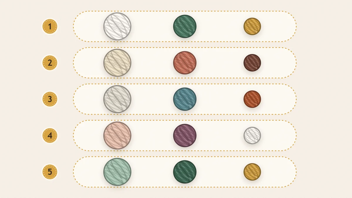
Each palette below follows the main, secondary and accent pattern. Yarn color names vary, so use the descriptions to find the closest match.
| Palette | Main (60) | Secondary (30) | Accent (10) | Suits |
|---|---|---|---|---|
| Warm Clay | Cream | Terracotta | Mustard yellow | Rooms with wood floors, tan leather and brass |
| Coastal Calm | White | Soft gray-blue | Navy | Bright rooms with white walls and pale wood |
| Forest Cabin | Warm beige | Sage green | Deep forest green | Rooms with plants, dark wood or stone |
| Soft Dusk | Light gray | Dusty rose | Plum | Bedrooms and reading corners |
| Modern Contrast | Ivory | Charcoal | Ochre | Minimal rooms with black metal and clean lines |
Where to Put the Color
The same three yarns can look calm or loud depending on how you arrange them.
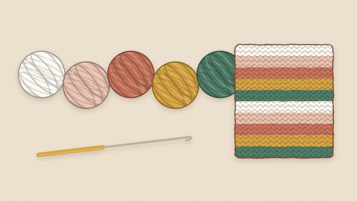
- Wide stripes read as blocks of color and feel relaxed. A chunky crochet throw blanket in one main color with a band of accent near each end is an easy first try.
- Narrow stripes blend from a distance and look busier up close. Keep them for small pieces.
- A contrast border uses very little accent yarn and frames the piece neatly.
- Color blocking, with the front of a pillow in one shade and the back in another, gives two looks from a single crochet throw pillow cover.
Light and dark matter as much as the hue. Three mid-tones of similar depth blur together, however different they look on the ball. Aim for one light, one medium and one dark, and stripes will stay crisp from across the room.
Test With a Swatch First
Yarn balls sitting side by side do not predict how the colors behave once they are worked together. A small test does.
- Chain about 20 and work a few rows of each color in roughly the proportions you plan to use: six rows of the main, three of the second, one of the accent.
- Carry the swatch into the room and lay it on the sofa, bed or table where the finished piece will live.
- Look at it in daylight and again in the evening under lamps. Warm bulbs push colors toward yellow and can dull blues and grays.
- Take a photo and switch it to black and white. If two stripes turn the same gray, they are too close in depth; swap one for a lighter or darker shade.
Fiber changes color too. Cotton tends to look matte and crisp, while acrylic and wool blends often look softer and slightly deeper, so swatch in the yarn you will really use. The guide to the best yarn for crochet home decor helps you settle the fiber before you commit to shades.
Frequently asked questions
How many colors should one crochet decor piece have?
Two or three is a comfortable range for most pieces. One color shows texture best, three gives enough variety for stripes or a border, and more than four usually needs careful planning to avoid looking busy.
Should all the crochet pieces in a room match?
They should relate rather than match exactly. Sharing one or two colors across pieces is enough to make them look like a set, and varying the stitch or the proportions keeps the room from feeling uniform.
Does variegated yarn work for home decor?
It works best in simple stitches on small or medium pieces, where the color changes become the feature. Pair it with a solid that picks up one of its shades, and avoid combining it with heavy texture.